
Building an online class library is not as simple a task as I had initially imagined it to be. There are so many details that relate to the young audience’s scholastic capabilities that differentiate such a platform from many other content-browsing and uploading sites out there.
The trickiest issues I’ve encountered in creating an online class library for young students are:
- figuring out the balance between browsing content and creating content
- building a system for creating content that has been approved by the teacher and ready for review by fellow students
A few weeks ago I got to conduct some user testing for screens I had developed.
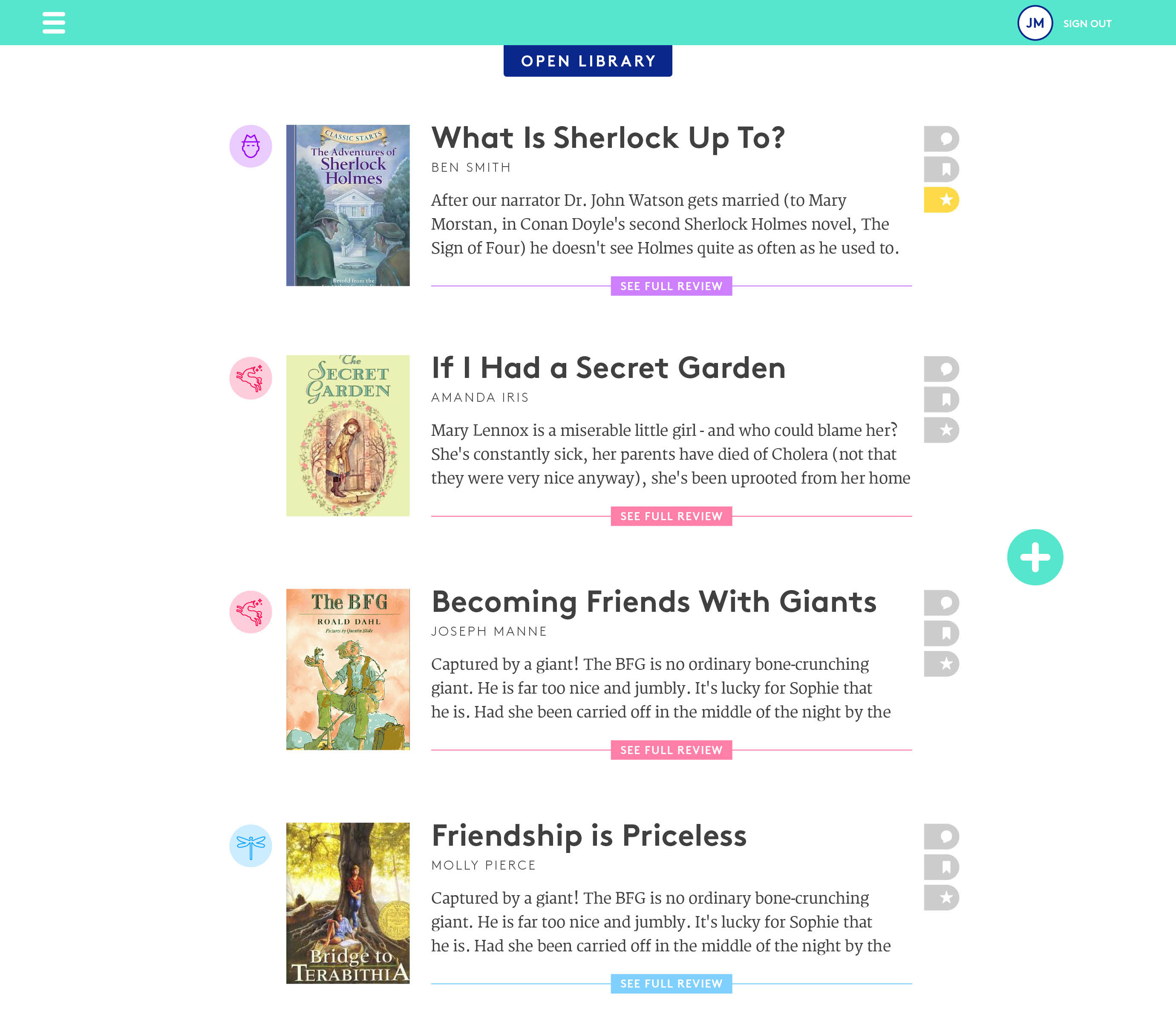
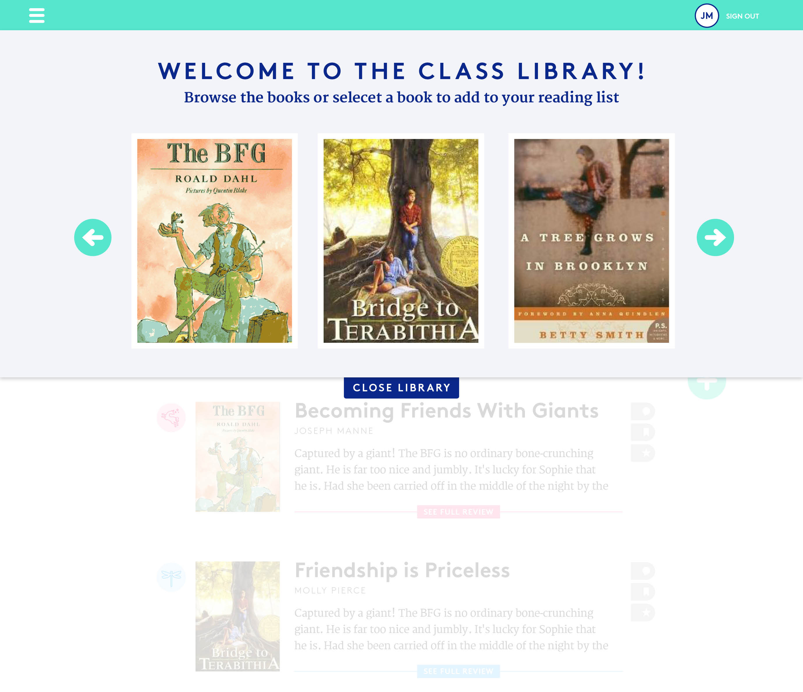
The site I created is built in a way where the teacher is the main admin, who then invites students to join the class group online. The students have their own login, but have limited access. As far as uploading goes, the conclusion I have come to is to have the teacher be the middleman between the student’s content upload and actually having it published on the site. In other words, when the student wishes to upload content, it is sent to the teacher, who approves it and triggers the actual “publish” action.
The flow for uploading content has been a huge question mark, but I think I may have cracked it this week.
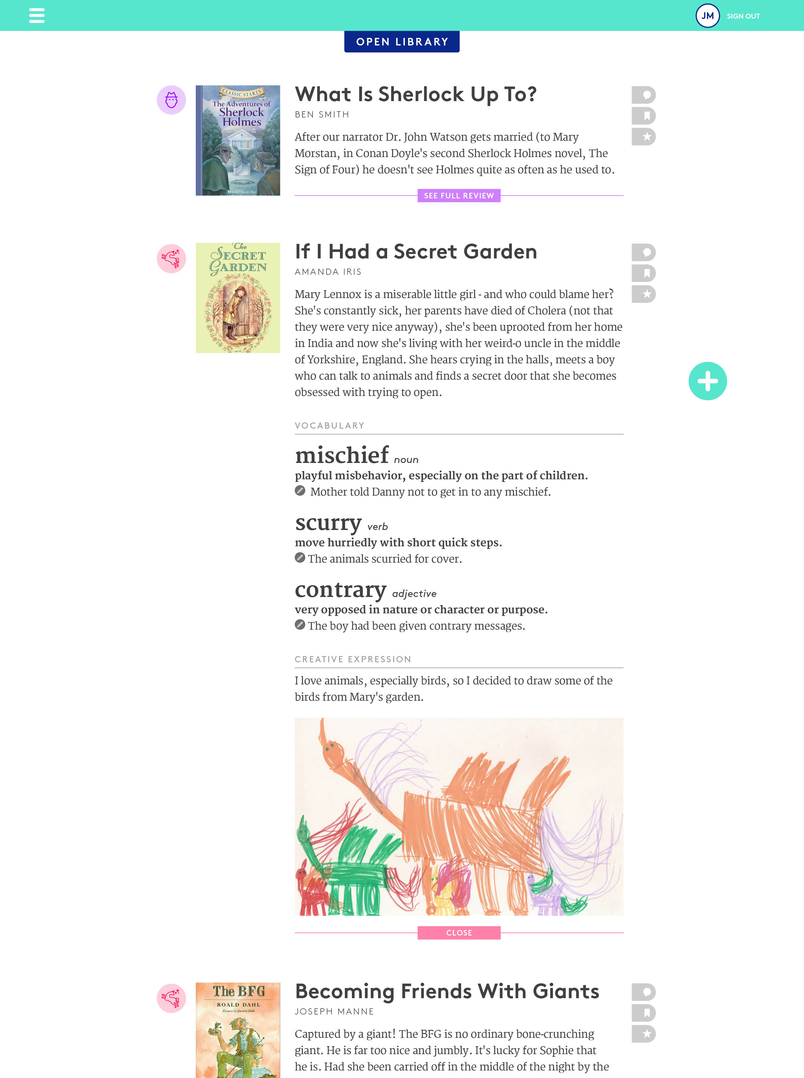
Some points that were brought up in the user testing session were to possibly change the entry view to be more iconic rather than textual. I agree that having an image of a book that triggers the students to click and dive deeper to the review is probably a more user-friendly experience than the text-based view, which may seem intimidating to students of such a young age.
It was also mentioned that the idea of having post expand and collapse on the same page may be not be focused enough. An alternative suggested was to have the students click on an icon of a review that would direct the to a separate and focused page of that one review.
Another thing that was addressed was to refine the language of the site, and to perhaps address to various parts and actions in a younger tone of voice.
After taking these and other notes in consideration, I came up with an alternative layout for browsing between book review entries:
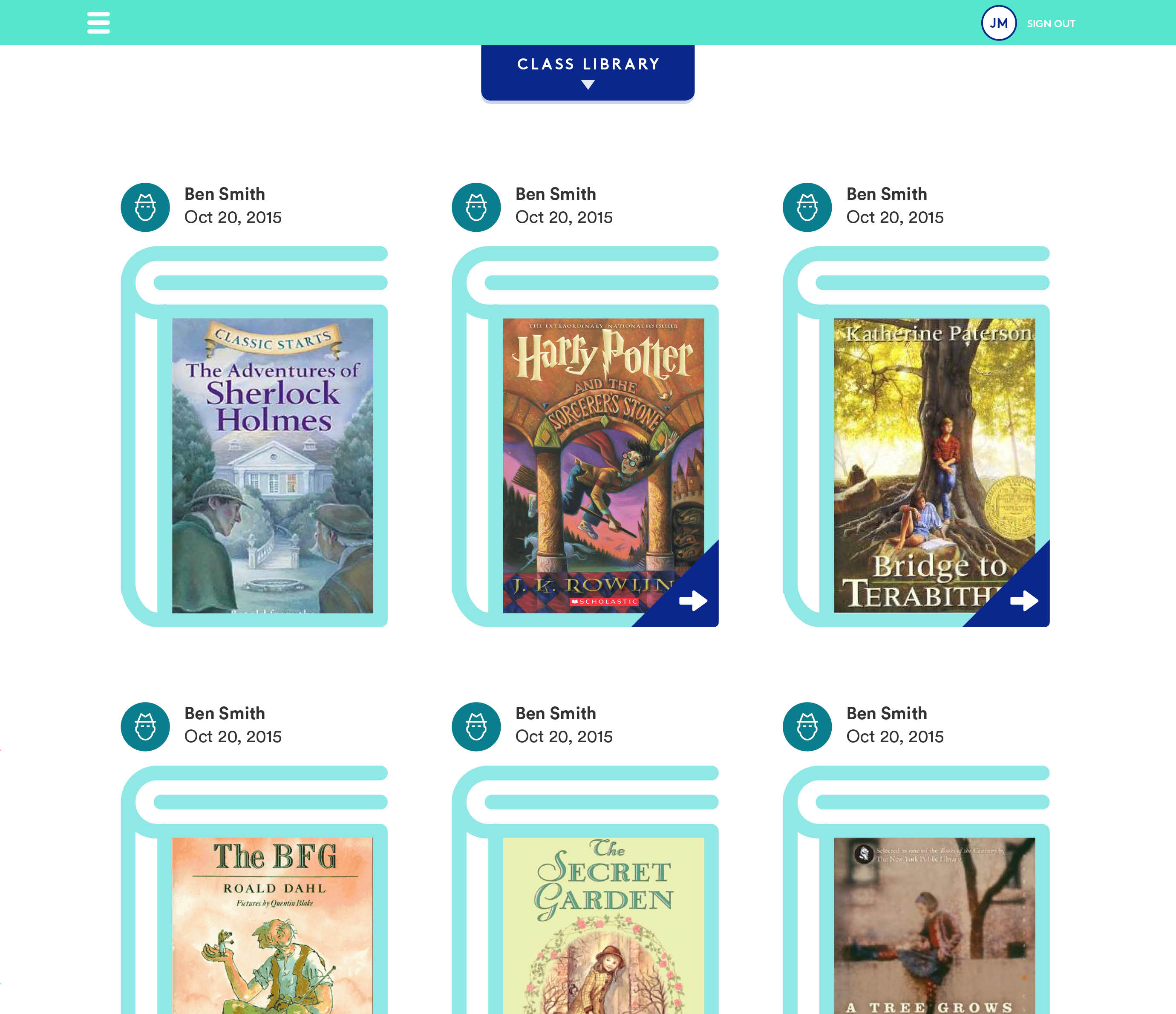
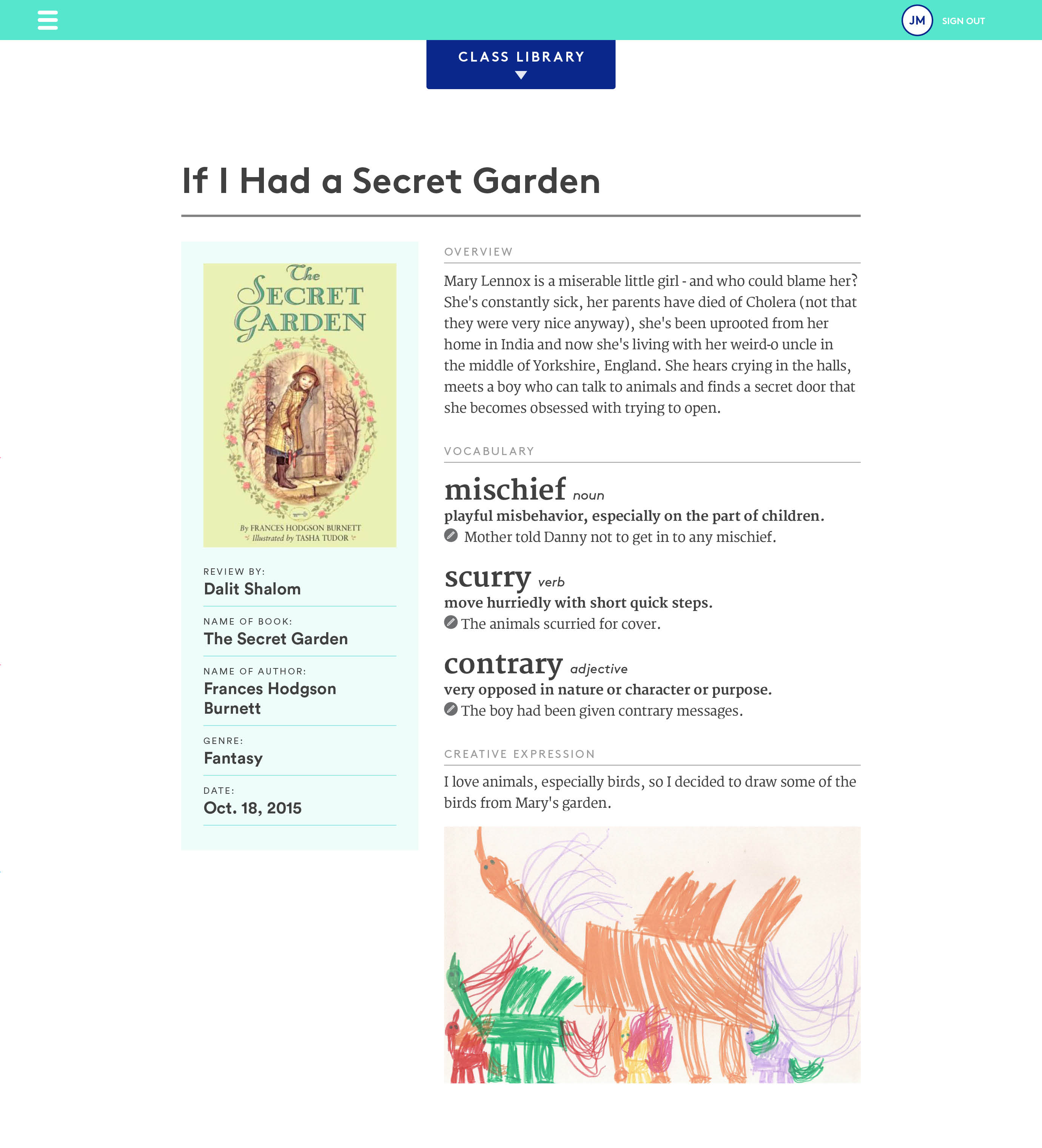
This layout also gives a quick view of the book’s details, such as title, author, and genre. As for the content upload side, after speaking to Kim, we decided that an “offline” worksheet that would then be uploaded to the class library would be the best solution. The worksheet would be corrected by the teacher and after the drafts and corrections, the student would upload the “answers” that would then be generated to a post for viewing by the class.
What will this worksheet look like? How long will it be? How will the teacher make corrections on it? And how will it be uploaded to the class blog? All these questions are yet to be answered, so stay tuned!